One of the best company to work and IT solutions. Delivered product quickly and very fast. It was really mice working with them. I will give them move orders.
- Whatsapp Chat
- Telegram Chat
- Email: info@tritansolutions.com
- Skype:
- Login / Register
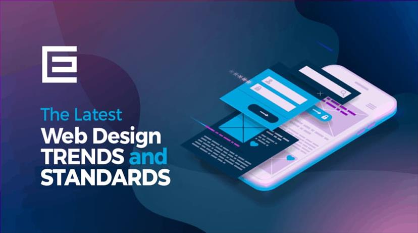
Creative Web Design Trends and Inspiration for 2021 .
Some website trends quickly become outdated, whereas others will only improve as time goes on. The biggest web design trends are set to dominate

Trends and time give one warranty that they will never be identical to each other. Every year brings new website design trends with it. Web design is continuously shifting and getting imaginative. Technologies are enormous, and we are glimpsing that designers are similar to technologies. The recent trend in design is not only restricted to objective-oriented, but so many new characteristics are encompassed now like dynamic scrolling, custom illustrations, color trends, emphasis on UX/UI, etc., and it’s getting more efficient every year.
1) White Space
Utilizing white space wisely can provide a promising look and essence to your website. It develops a visual sequence where no element distracts your viewers. With white space, you can target what critical message your visitor requires to look at initially. The user will not be diverted and bewilder by that.
If you will utilize less white space within two elements, then the user will glimpse them as one element. With that, they can skip crucial data or what they were looking for. Users can be lost when they discover Crowded elements with each other. So try to utilize white space as enough to distinguish information. Understanding how to utilize white space on your website will enable you to enhance your site’s user experience.
2) Digital Illustrations
Illustrations are a comprehensive tool. Digital illustrations make a website unique from a mob of the plethora of websites. Illustrations that can tell your brand story of your website in 1 picture. It can develop a subjective bond with website visitors. Largely digital illustrations are utilized in hero-banner and feature explanation. So without reading text, Illustrations can enable your visitors to comprehend your brand message.
With 1 glance at Illustrations, the user will understand your brand product or service which you deliver. Your website will start gaining popularity slowly.
3) Dynamic Scrolling
If you’re glancing for tremendous creativeness for your website, then Dynamic Scrolling is your go-to alternative. It conveys your visitors a 3-D experience and enables them to associate with the brand and improve deep customer connection. You can utilize background video & pictures or Abstract Shapes for animation. You can use – play video on a scroll and make animation on the scroll to convey your website a supernatural impact and amazing user experience.
You must take steps with caution when utilizing such an influential tool. You don’t need to utilize any scrolling effect that can divert your visitor, and you must moreover assure that it isn’t animation-heavy because that might hamper the speed of your website.
4) Color Scheme
Selecting colors for a website is very crucial for your visitors. You can’t utilize colors that you love; you need to select colors that can enhance the website and branding of the company.
Energetic colors provide visual interest to a layout. User attention is a valuable aid, and one of the greatest beneficial ways to grab attention is by utilizing colors that stand out. Glossy colors utilized for the background can apprehend the visitor’s vigilance and contribute to a completely extraordinary experience.
We can utilize gradients in numerous ways which boost the profundity of design. Trending graphic design utilizes massive, bold, and color gradients that characterize the design in depth. Utilize gradients rather than almost plain backgrounds. Gradients can grab visitors' eyes because gradients encircle a spectrum of colors. Your colors must fit with your brand message.

5) Background Video
The trend for the website banner is now to add background video rather than pictures. Pictures tell your brand opinion to the visitor, but the video can indicate your concept creatively to the website visitors. It enables the designers to convey the major idea rapidly. Now internet connections have great speed, so background video makes a promising experience for visitors. It is nice to select the video with sound and play In the loop simultaneously.
6) Bold Typography
The welcome heading is greatly crucial for the website. So that it is most crucial to illustrate the text as it improves valuable brand messages to visitors. Bold typography enables designers to accomplish that. Bold fonts are susceptible to examination as compared to normal fonts. So, it is indicated to utilize bold fonts for headings.
Fonts are playing a massive function in your website. It is an influential tool for grabbing your audience’s scrutiny. So, utilize fonts associated according to your business or its services, like if you are creating a charming and elegant site, then you can utilize serifs type’s fonts. But if you are making a professional website, then utilize easy fonts and sans serifs.
7) Iconography
Iconography conveys the language of icons. Which can depict features, functionality, or content. In Web Design, utilizing icons that can be comprehended, and understood instantly, we can make a promising influence on the user’s mind. We don’t have to jot down the title about what we are demonstrating, but the user will immediately comprehend our point of view.
8) Unusual Navigation
It’s tough to anticipate what designers can make with imaginative minds. Young designers constantly make experiments with their imagination and mind, and sometimes they make surprising things. Unusual Navigation is one aspect of this.
Extraordinary websites always require extraordinary designs. Unusual navigation is not a popular trend, it is a tricky trend. Navigation has to supervise users through a website. Sometimes designers concentrate on what the user is glancing for and where they have to place it. Unusual navigation can creatively amaze viewers.
• 8 Leading Web Design Trends to Monopolize in 2021
User anticipations and digital advancements mean that design trends are shifting all the time. Some trends promptly become obsolete, whereas others will only enhance as time goes on. Digital agencies (and website owners in common ) need to maintain a cautious eye over design trends that gain momentum.
Shoppers visit plenties of websites every day, which implies they’re always glimpsing creative, well-designed platforms. With more and more online shopping brand entering their game, it’s more crucial than ever to attract customer attention and get them to select your platform over everybody else.
A victorious way to do this is to create a creative & productive website. Let’s analyze the prominent design trends that we anticipate to be dominant in 2021.
1. Dark mode
It was already a massive trend in 2020, dark mode is all set to evolve more even prominent next year too. Here are some of the fundamental explanations as to why designers adore dark mode:
• It glimpses as super-modern. Instagram, Twitter, Facebook, and Apple are almost a few great brand names that give alternative themes in their platforms.
• It highlights and enables other design elements to bang-up.
• Reduces eye stress in low-light conditions. Think how many of us scroll through our phones at night when we’re meant to be dozing.
• It can even conserve device battery power!
Numerous platforms provide users with the proficiency to select when to shift to dark mode. Apple users can even plan times to alter their device's dark mode automatically.

2. Extraordinary color mixtures
One of 2021’s most popular web design trends will be the usage of bold colors and extraordinary color mixtures that flawlessly adapt with each other to catch users’ eyes. Glossy, saturated colors also enable your brand to stand out from the minimalist designs of earlier retro years.
To succeed in executing this trend, you shouldn’t be afraid to attempt fresh things. Gleaming colors, fierce colors, and extraordinary color pairings will stick in the remembrance of your website visitors.
Dark, charcoal shades conceal behind blazes of violet and muffled jade greens in this design. It’s an excellent color strategy for those glancing for charm with a contemporary, dynamic feel. The color mixtures are adaptable and extraordinary.
For example - The dark and remarkable color mixture utilizes a current web design trend. The usage of a dark background with glossy and aggressive accent colors is evolving more prominent in recent designs.
3. 3D elements
3D design elements have fascinated website users for numerous years now. Thanks to evolving web technology and web designers constantly upping their game, 3D elements are being increasingly utilized. This design trend is only getting on to evolve more prominent as VR/AR technologies earn more momentum and add additional elegance and influence to 3D elements. The outcomes can be extraordinary. One of the most crucial requirements for a prosperous 3D graphic is the outstanding performance of your website.
Your platform should be promptly loading and well-optimized. If it’s not, your website won’t be able to assist with such huge content. Your website may seem sluggish and unresponsive, and so on.
4. Asymmetric layouts
For several years, websites have been founded on a grid layout. This has always been a prominent strategy because it oversees the structure and enables you to concentrate on pivotal elements. Still, this does restrict how completely imaginative you can make the site if your design must match within a particular template. The upcoming trend is asymmetric design. It’s an excellent opportunity for brands to avoid traditions and examine extraordinary, fascinating designs.
It is significant to remark that balance is still required. Even with an asymmetrical design, no aspect of the design should look bigger than another. Even though the objects on either side are not specifically symmetrical, the content still looks systematic and harmonious.
5. Voice user interface
How users access data is altering all the time. Rather than typing a search query into Google, we now implore problems or make demands. This implies that web design furthermore needs to diversify to keep up with the emergence of voice chatbots and virtual assistant tools.
Today the design trend hasn’t entirely taken off yet among many companies. It’s only a matter of time before we glimpse more and more websites integrating voice search as an extra option to conventional text search.
6. Integrating photography with graphics
Another huge trend for 2021 will be coinciding with graphics onto photography. High-quality photos already look tremendous on their own but enlarging in some cool graphics will demonstrate your imaginative piece of work.
Here are some of the prime reasons that web designers are blending graphics and photography:
• It’s an excellent way to add additional individuality to your web design.
• Yet another means to strengthen company branding. Think of the shades & shapes utilized in your logo, for instance.
• Adds depth and keeps website visitors entertained with your content.
• If you want to get the promising from this trend, centralize your graphics with your brand personality.
7. Website load time
One of the greatly important aspects of prosperous web design is ultra-fast loading time. This isn’t a new trend and has been a crucial factor in UX and SEO for years. It proceeds to be a leading preference for websites that need to rank high in the search results and convert better too.
Observations show that if your site takes longer than 3-4 seconds to load, visitors will most plausible be leaving. And they possibly won’t be back ever. Website loading times are a common metric that all web designers glimpse at to assure a considerable user experience. If you need to understand how to enhance your website performance and enhance page load time.
8. Smart content loading
Plenty of websites are culpable of being a little too huge on graphical elements and third-party integrations, all of which can hamper your website down. Thankfully, there are numerous means to cultivate creative sites that only download the content that the user desires to read. Sluggish loading is another web design criterion that has already been utilized in recent years. It’s a prominent strategy with long, one-page sites.
Contemplate this. Many website visitors never arrive at the bottom of a page. So why would you load that content and needlessly expand your site load time? A great strategy would be to load the content as the user commences to scroll down the pages and gets closer to it.
Sluggish loading assures that the web browser only downloads the content you desire to glimpse on the screen, without squandering precious time and resources to load offscreen content that the user might never glimpse.
In 2021, we anticipate seeing an abundance of aggressive, eye-catching websites utilizing animation and mixed media to strengthen the user experience. Page speed and great user experience will still be at the vanguard. If you’re glancing for a unique and user-friendly website to take your brand to the next phase, then let’s discuss. Call us today!

Conclusion
Always follow the latest trends and ideas that can strengthen our website’s view and functionality. If we will not be with the trend, then it will not take long for us to get out of trend. So, constantly look around for the various website trends and examine good websites. But take care that the trend does not make a side-effect on the website’s execution. Large pictures or graphics can boost the look and significance of our website, but not at the expense of loading speed.


